B2B self-service ordering platform
A self-service wholesale ordering portal designed from zero for a professional cosmetics distributor — replacing roughly ten manual ordering channels.
Sector
B2B E-commerce · Wholesale distribution
Year
2024
Timing
~3 months
Role
Lead Designer
Type
0→1 · Product Design · UI Design · Design System
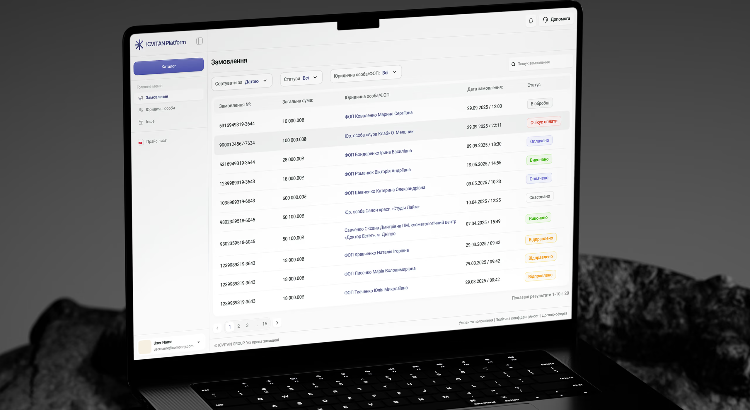
01 — Context
Every B2B order went through a manager, by hand
Our client is a Ukrainian distributor of professional cosmetics (7+ brands and an assortment of hundreds of SKUs). Their customers — beauty salons, clinics, pharmacies, and online retailers across Ukraine — are served by sales managers, each handling 30 to 130 clients.
When we started, every order was processed manually, and the channels it could arrive through had grown to about ten. A client would dictate an order by phone, send it on Telegram or Viber, by email, or simply drop a photo of a handwritten list. The manager had to enter it into the BAS ERP system before 12:00–15:00 to ship it the same day; otherwise it waited until the next. Errors were the norm: product names were approximate, volumes had to be clarified in separate back-and-forth, and every order passed through human interpretation.
As the business grew, so did the cost of each error: more clients, more orders — and the same manual link in the middle.
The stakeholder (the owner) framed three pain points directly:
The three pains the project started from
1. The manual process degrades service.
2. The manual process degrSpeed: "an order comes in Friday evening and nobody processes it — wait until Monday. That's shameful service."ades service.
3. User error: there are many users, not all of them careful — the system has to constrain them and be "error-proof."
The business goal: let partners order on their own, 24/7, from a structured catalog — removing the manager as a bottleneck while preserving the complex B2B logic of contracts, multi-entity billing, and personalized pricing.
02 — Role
Owning design end-to-end, from discovery to delivery
I was the Lead Designer and ran design across every stage — from the first client conversation to release. Part of the PM responsibilities sat with me too: stage estimation, creating and tracking tasks in JIRA, and distributing workload across the designers. The other part was on the Account Manager, who wrote the initial brief and was the client's main point of contact.
What I owned: adapting the brief into design and breaking it into subtasks and steps, the design system from scratch, defending and presenting design to the client, presenting to the developers, and direct communication with them on edge cases. Designers implemented tasks under my direction; QA and the developer covered their parts.
03 — Discovery
Orders came from everywhere, and every one was interpreted by hand
Stakeholder sessions
One session reshaped our understanding of the architecture: we had assumed the CRM (PlanFix) took part in order processing, but the stakeholder clarified that PlanFix is for B2C and manager analytics, while BAS is the single source of truth for orders, documents, prices, and contracts. A structural fact reinforces this: managers were deliberately cut off from BAS — they work only through PlanFix, and only admins make changes in BAS. So the old manual path through the manager is structurally closed after launch.
Regular meetings with the operations manager and the owner: several times a week at the start, then steadily once a week, and biweekly toward the end. These were both discovery (ordering workflow, BAS structure, contract logic, verification) and continuous alignment before investing in hi-fi. After key meetings I sent a follow-up with the agreements recorded and updated the integration scheme — so every decision left a written trace both sides could return to.
User interviews
Interviews with the client's managers (among them the operations manager, the project's main working contact) and a little with the client's own end customers.
Contact with managers didn't stop at research: during design I sent them interactive prototypes and gathered feedback on concrete decisions, and after launch I gathered it at DEMO sessions. The managers were both the source of requirements and the first to test the flow on themselves.
Key findings → decisions:
- Fragmented ordering creates errors. Numerous channels, no standard; each manager had their own approach to each client. → A structured catalog with photos, SKUs, and exact names instead of free text.
- The manager is the bottleneck, not the system. Every order required manual entry before the 12:00–15:00 deadline. → A self-service portal with automatic BAS synchronization.
- Multi-entity is the core complexity. A client can have up to 40 FOPs/TOVs, with different contracts, payment terms, and addresses; the data in BAS is partially filled and unstructured. → A dedicated legal-entities section with a full verification lifecycle.
- After-hours orders are lost service. The business runs Mon–Fri, salons run evenings and weekends. → 24/7 ordering with invoice generation through BAS.
- A non-technical stakeholder. Decisions were made visually, not from a spec. → A visual-first process with interactive prototypes at every step.
04 — Access model
Show everyone the catalog, gate the price behind verification
The stakeholder's requirement was literal: "you can see the product but you can't see the price." From this grew an access model I deliberately built on two independent axes, not as a simple staircase.
The functionality axis splits users into those who see the catalog without prices and those with full access (prices, orders, documents). The registration axis splits them into those without an account and those with one. These axes don't coincide — and the most interesting state sits exactly at their intersection.
There are three real states:
- Unregistered — catalog without prices, CTA "Sign in."
- Registered, not verified — the same catalog without prices, but a different CTA now: "Get verified." In functionality they're identical to the anonymous user; in registration they're already in the system. This is the buffer zone at the intersection of the axes.
- Verified — full access.
That the first two states share identical functionality but different CTA microcopy isn't a detail — it's the point of the decision: I distinguished states by the user's context, not only by what they were allowed to do. The anonymous user must sign in, the registered one must verify; the action differs even though the screen is the same. The fourth theoretical cell (full access with no account) is empty by design — and that visibly proves why verification is mandatory.
Among verified users there are two legal-entity types: FOP (sole proprietor) and TOV (LLC). The difference is legal (different documents and fields), the functionality is the same. We also accounted for clients splitting into existing ones (already in BAS) and new ones (registration → moderation within 24 hours, initially on business days → contract via "Vchasno" → full cabinet).
The project's core bet
Show the assortment to everyone, but open the price and the transaction only after verification. It's both a business requirement and a conversion mechanism: the partner sees what they need and has to verify to buy it.
05 — Key decisions
Hiding the hard parts of B2B behind familiar e-commerce patterns
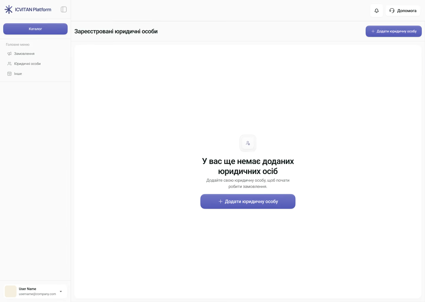
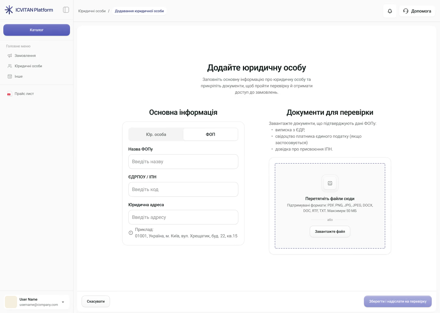
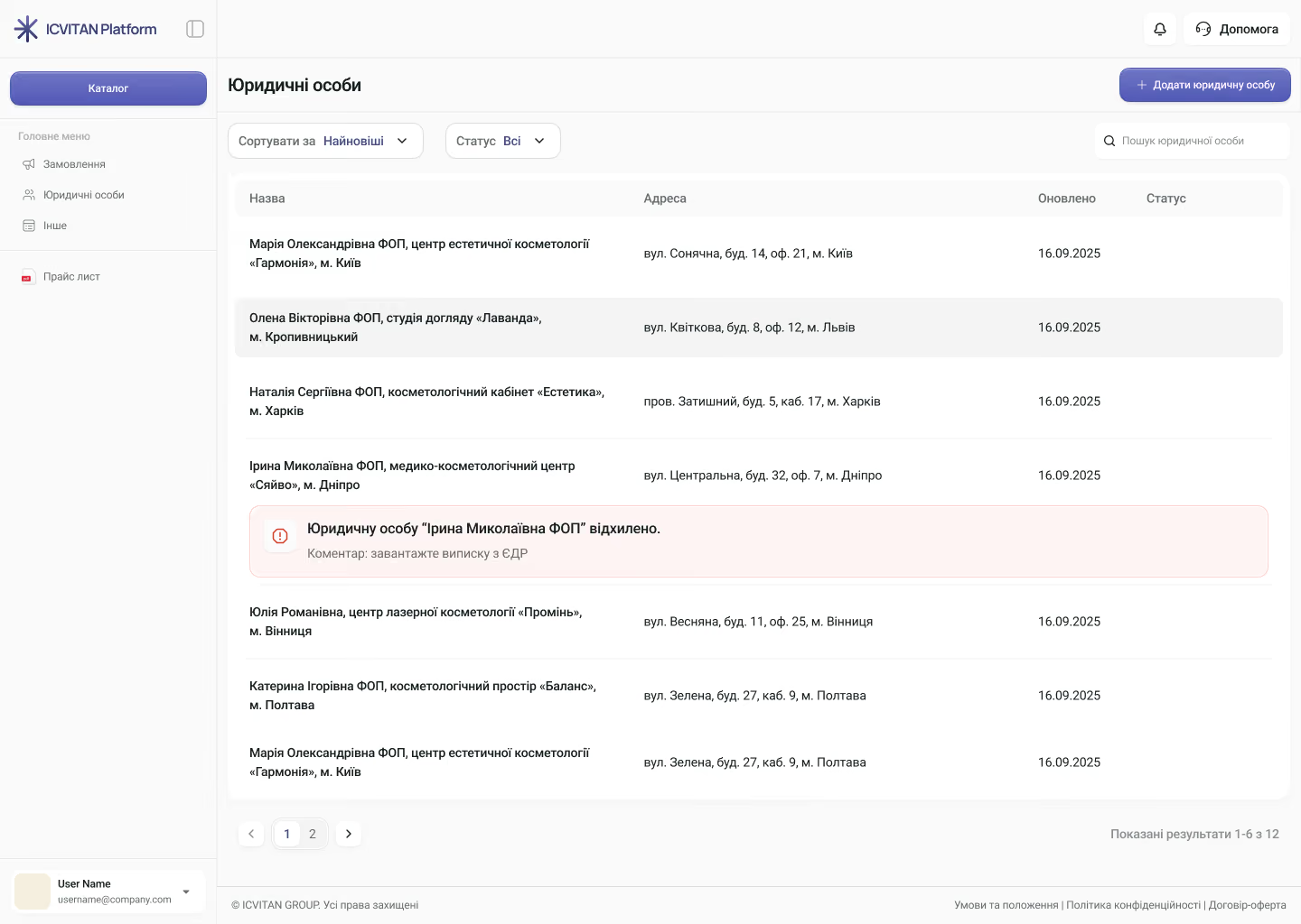
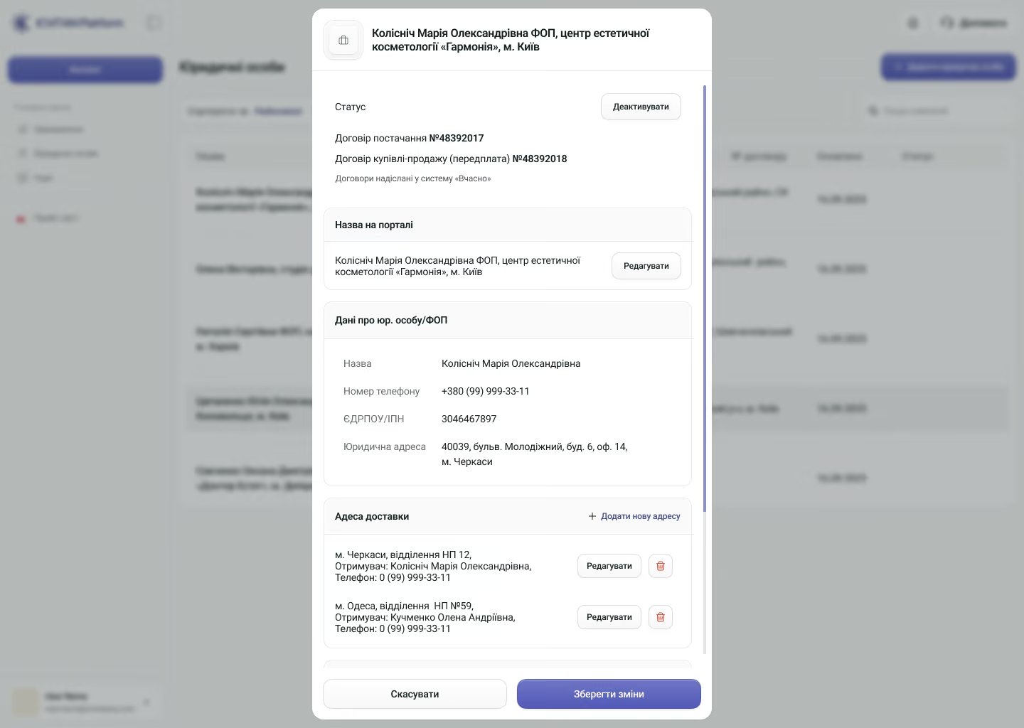
We moved the informal, phone-based client moderation into a structured UI. Company List works as a state machine with four states — Pending, Approved, Rejected, Deactivated — plus a resubmission flow. The most important decision is rejection: the admin writes a specific reason ("upload the EGR extract"), and the client sees it inline together with a "Resubmit for verification" button. What used to be a manager's phone call became a self-service loop. For clients with dozens of entities (up to 40), the list scales with sorting, status filtering, search, and pagination. The FOP/TOV toggle dynamically changes the list of required documents.
The catalog shows the entire assortment to everyone, hiding only the price. For verified users, the wholesale price appears alongside the RRP (recommended retail price) — a direct need of the online retailers among the partners: margin visible at a glance. Prices are personal, fixed by the terms of cooperation, and pulled from BAS. Filtering is domain-specific, not generic: brand, category, availability, and 14 purposes ("anti-dandruff, psoriasis, eczema," etc.).
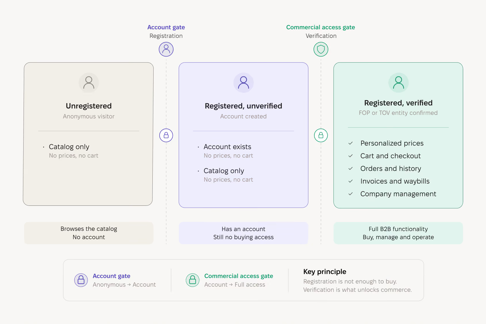
Access model — three user states separated by two gates: the account gate (registration) and the commercial access gate (verification). Accent: registration alone grants no buying rights; the registered-unverified user has identical functionality to an anonymous visitor but a different CTA. Purpose: show why verification, not registration, is what unlocks commerce
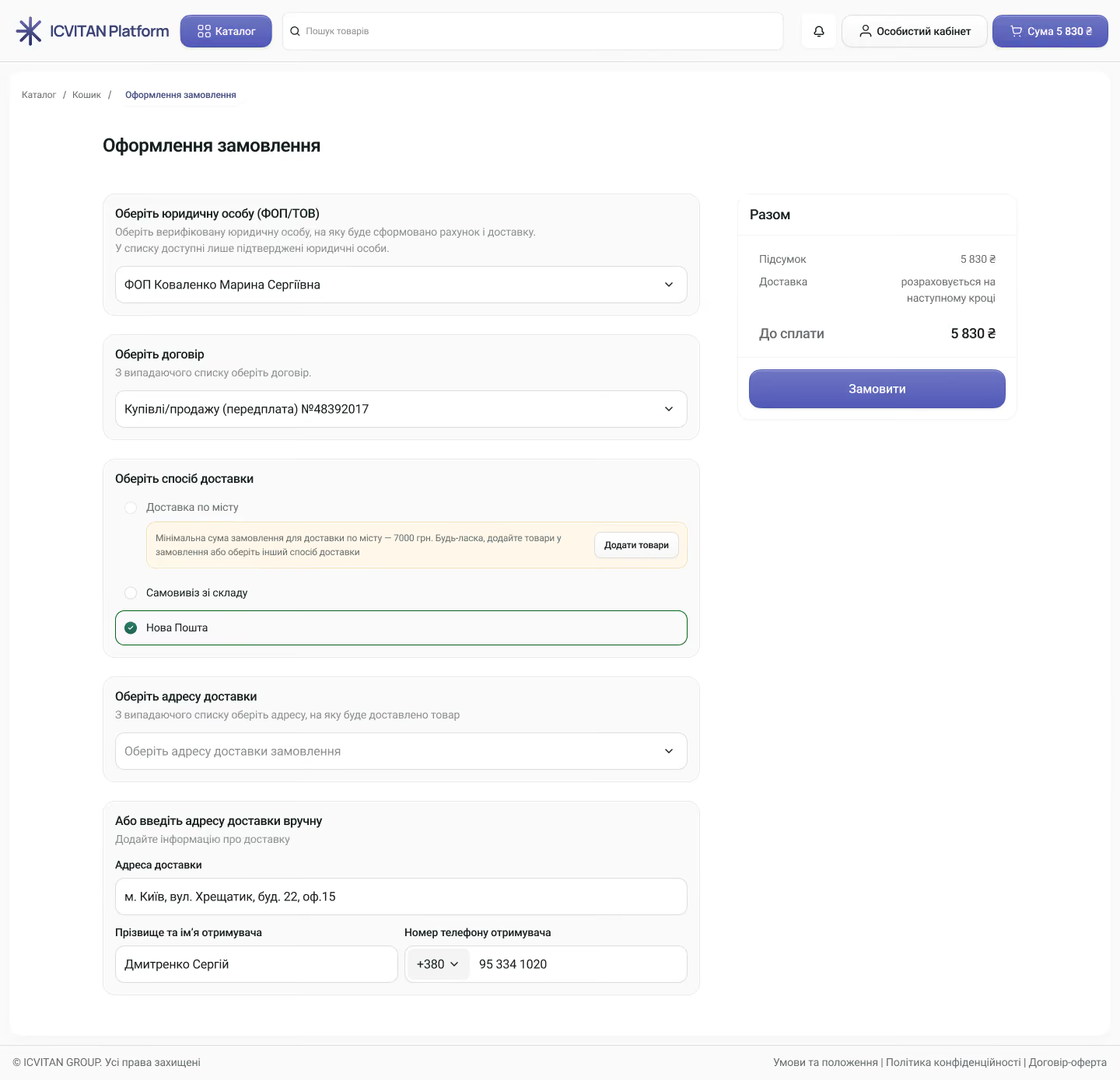
The complexity (multi-FOP, multiple contracts, different terms and addresses) is hidden behind three steps with data pulled from BAS. The client chooses which of their FOPs to pay from (the seller side is fixed by the contract and not editable); the contract determines the payment terms and shows them as non-editable; then chooses delivery. One detail: city delivery with a 7,000 UAH threshold is shown not as an error but as a disabled option with an explanation and an "Add products" CTA — the limit becomes an upsell nudge. The asynchrony of BAS sync is also handled at the UI level: after placing an order, the client sees a banner — "the manager will prepare the invoice and waybill within a few minutes" — and a document-availability timer, instead of silence and uncertainty.
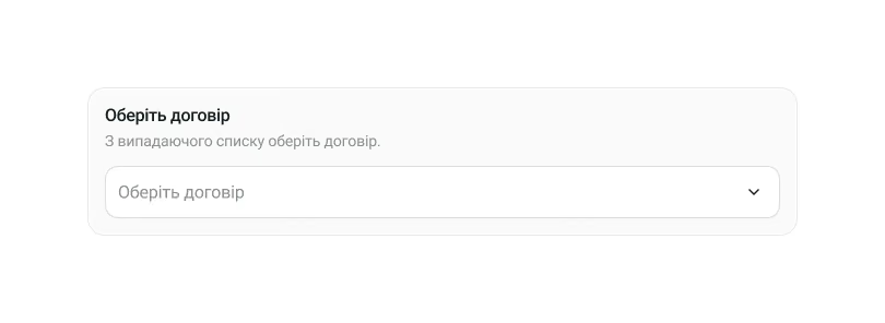
The design accounts for three types — prepayment / deferred payment (e.g. up to 14 days) / commission (goods on consignment). The current UI surfaces two, with room left for more: the main work with contract types is under the hood, in billing logic and BAS sync.
B2B clients restock the same items regularly. "Repeat order" in one click, with a confirmation modal ("the items from this order will be added to your cart") — because the cart may not be empty. It works on cancelled orders too.
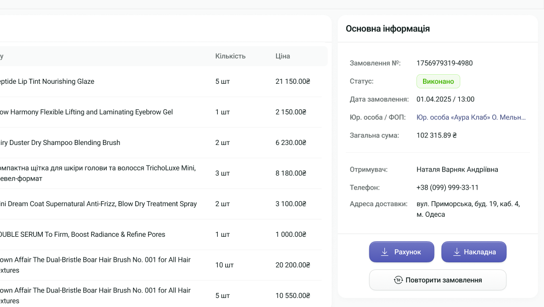
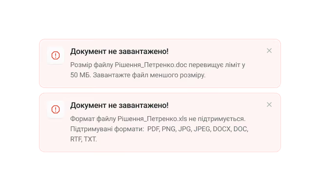
A separate principle at the stakeholder's request: unavailable options are dimmed with an explanation, file formats are validated, steps can't be skipped. Fewer ways to do it wrong.
The sales team kept their own tools: PlanFix for client work, with write access to BAS left to admins. The distributor set that boundary before design started, and it constrained what I could solve on screen. A rejected company had to explain itself in the interface, since no manager would call to say which document failed. BAS had to push payment status from bank reconciliation, since nobody would mark an invoice paid by hand in the portal..
For the sales team, one thing changed: they stopped retyping orders. Orders reach BAS without them now, and they work the cases that need a person. Per the client, overtime became the exception.
06 — Design system
Building the UI foundation from scratch, since none existed
The client had no UI kit — only a few brochures. I built the design system from scratch and maintained it: a token structure (Figma variables — colors, typography, spacing), naming, page structure, 22+ component groups (buttons, forms, navigation for desktop and mobile, alerts, badges, cards, illustrations), and 24 icon categories. I also reviewed components from other designers and enforced the guidelines. The system delivered consistency across 110+ screens in 8 product flows (130+ frames including the design system), each flow with full desktop and mobile coverage and multiple states.
07 — Mobile
Full parity on mobile, because people order standing next to a client
Every flow was built for desktop and mobile with full feature parity — not responsive scaling, but a deliberate redesign for touch that keeps 100% of the functionality. The Company List table becomes a card-based list, the filter sidebar becomes a full-screen overlay, checkout stacks vertically. This isn't cosmetic: the users — cosmetologists and salon owners — often order from a phone, standing next to a client's chair.
08 — Results
What changed, and what I can and can't yet prove
The platform launched in autumn 2024 and has been in production 18+ months, actively used by partners. I have no direct access to analytics, and the client keeps some numbers under NDA — so below I clearly separate what's known from what isn't.
What's known:
- Repeat order exceeded expectations. In months 3–6 after launch, 28% of orders started from "Repeat order"; of those, 57% were placed unchanged and 43% after modifications (adding new items or removing old ones). The first 2–3 months it naturally "ramped up," since order history was only accumulating. This confirmed the recurring-purchase pattern was read correctly.
- The flow was standardized. From about ten channels (messengers, calls, email, photos) to one primary and a few auxiliary.From about ten channels (messengers, calls, email, photos) to one primary and a few auxiliary.
- After-hours orders became the norm. It used to be effectively an anomaly: an order outside working hours generated manager overtime or a wait until Monday, because the manager picked it up during their own working hours. Now the client orders whenever — the volume of after-hours orders grew significantly.
- Manager load was lifted. Per the client, the critical load was removed: overtime became the exception, and managers are occupied with their core duties.
- Support requests dropped significantly (per the client; no precise reports provided).
- The transition was designed, not left to chance. All existing clients were brought onto the portal centrally: a one-time import from BAS, generated logins and passwords, distributed access. And after launch we ran separate DEMO sessions for clients — to show the advantages of the new flow and soften the transition. Adoption here is part of the design, not a side effect.
What's not yet known
The client doesn't disclose the number of registered partners, verified entities, or orders per month (NDA / no access). So we don't cite these numbers and don't invent them.
09 — Audit
A heuristic pass on what shipped, and what I'd fix first
We did gather manager feedback on interactive prototypes, but the compressed timeline (~3 months including part of development) left no room for formal usability testing with scenarios and metrics before launch. To close that gap, I ran a heuristic evaluation against the final hi-fi mockups using Nielsen's 10 Usability Heuristics — 9 issues: 1 major, 5 minor, 3 cosmetic.
Major. The "you may also be interested" carousels on the product page showed prices and "Add to cart" to unverified users — a contradiction with gated pricing, the core conversion mechanism. Priority fix: the carousels must respect the access level.
Key minor. No onboarding for a new user (the full path isn't visible: registration → entity → verification → ordering); an information-dense company modal (contracts, addresses, documents in one scrollable panel — especially hard on mobile); no loading state in checkout between "Order" and confirmation.
The low issue count for a B2B platform of this complexity validates the approach, and the findings give a roadmap for v2.
10 — Reflection
What worked, and what I'd build in from day one next time
What worked. Visual-first communication with a non-technical stakeholder: every step was shown visually, and there wasn't a single conflict with the client across the whole project. Frequent alignment sessions caught discrepancies early (like the PlanFix/BAS clarification). Progressive disclosure as a strategy lowered the entry barrier, and the gated catalog turned a constraint into conversion. The error-proofing principle made a complex flow safer for a non-technical audience.
What I'd do differently. I'd build full usability testing into the timeline. We did collect feedback — managers commented on interactive prototypes during the project, and gave feedback at DEMO sessions after launch — but that was qualitative feedback on finished decisions, not structured tests with tasks and metrics before the design was finalized. Three months including development left no room for that. I'd embed analytics from day one: right now there's no direct access to data, and most of the impact has to be described qualitatively. And I'd formalize research artifacts during the project — we didn't make affinity maps, journey maps, or personas, and some of the diagrams existed but were lost.
What's next. A native mobile app, a chatbot and a separate B2C branch, a bonus system with gamification elements (for example, a free client day with a visiting trichologist for clients above a certain turnover), an LMS module for partner training and certification, and express delivery.