Testing a platform that connects businesses with student project teams
Through interviews and prototype testing, we confirmed interest in the model, uncovered the main trust barriers, and used those findings to shape the platform concept.
Sector
EdTech · Two-sided platform · Nonprofit
Year
2023
Timing
3 months
Role
Product Designer
Type
Discovery · Research · Prototyping · Usability Testing
01 — Context
A platform that didn't exist yet, and no proof anyone wanted it
KyivUX Design Community is a Ukrainian community of UX and product designers. Its active members also include UX writers, researchers, and business representatives. The community runs APOLLO IT School, with courses and lectures for designers of different levels and disciplines — Practical Product Design, Intro to UX Writing, and others.
The community's stakeholders had an idea: build a service that connects two worlds. On one side, IT course curators constantly lack real projects for their students. Students learn on made-up cases, which hurts motivation and portfolio quality. On the other side, there are businesses and startups that need to validate an idea but have no budget for an agency or freelancers.
The hypothesis
A platform could connect these two sides, with payment being a voluntary donation to the Armed Forces.
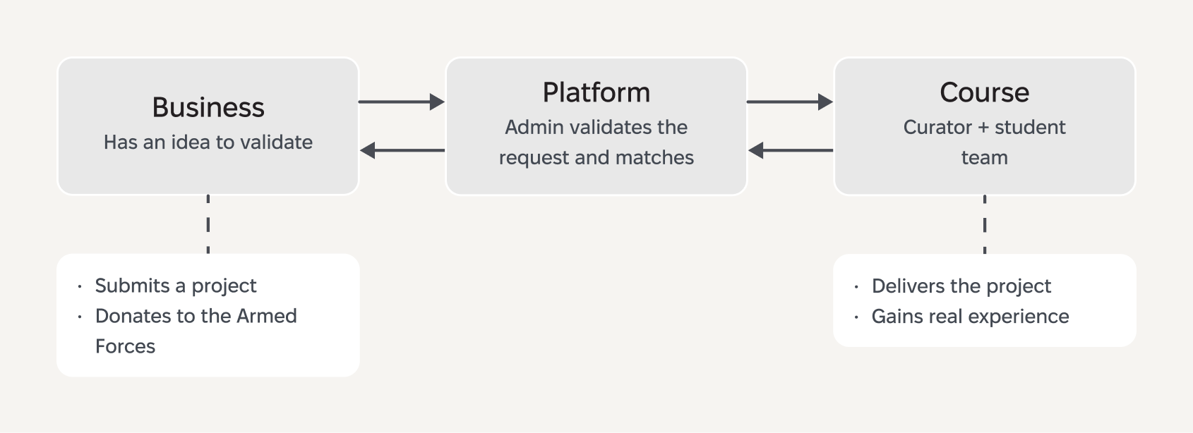
The proposed platform connects businesses that need affordable idea validation with supervised student teams that need real projects.
How we narrowed the focus
We had two audience segments, limited time, and only a few working sessions per week — this wasn't full-time work.
It quickly became clear: trying to research both segments meant understanding neither, and blowing well past our timeline. Students and curators are one behavioral model — motivations, pain points. Business is an entirely different one. Good research demands depth, not a shallow pass at both questions.
We focused on business. It was the riskiest segment: if businesses aren't interested, the service makes no sense — no matter how much students might need it. In the end, the bet paid off.
My role
The project started with four people: three designers and a newcomer designer with a project-management background. The designer with the management background worked as a designer on equal footing with the rest — she ran some of the interviews herself and contributed actively to the analysis. The fourth member left for personal reasons after the first meetings, and from then on we worked as three. At the first meeting we chose a lead designer by personal preference.
For a while the lead effectively acted as a regular designer, so coordination and key decisions shifted to me. I drove the entire discovery cycle and the communication with stakeholders:
- Research planning and hypothesis framing (Lean UX Canvas)
- Proto-personas and Value Proposition Canvas
- Conducting in-depth interviews (4 respondents)
- Facilitating the HMW workshop with the team and stakeholders
- Designing the CJM, user flow, and interactive prototype (4 iterations in Figma)
- Moderated usability testing of the prototype (4 sessions)
- Analyzing results and presenting recommendations to stakeholders
02 — Research
We went to the business side and asked if they'd trust students
Lean UX Canvas
Across these scenarios, three expectations became clear: reps needed credible data to show physicians, faster access to relevant content, and more flexibility to tailor the story for each meeting.
Business problem: Companies have ideas but don't always have the qualified specialists to execute them. Time constraints, limited budget, the need for a fresh perspective — all of it creates demand for an alternative way to validate hypotheses.
Users: IT course curators and instructors, startup founders, and small-business managers.
Key hypotheses:
- Businesses need a competent and affordable way to realize their ideas
- The platform will help businesses validate ideas or deliver projects
- Businesses are willing to pay for it with a donation
Using a risk/value matrix, we identified the riskiest hypothesis — whether businesses would trust students at all and pay for the result. It landed in the "high value / high risk" quadrant: if it doesn't hold, nothing else matters. That's the one we decided to test first.
Core hypothesis
We believe that the platform will help businesses validate ideas or deliver projects — and that this will lead to 5 completed orders and 5 donations to the Armed Forces through the platform.
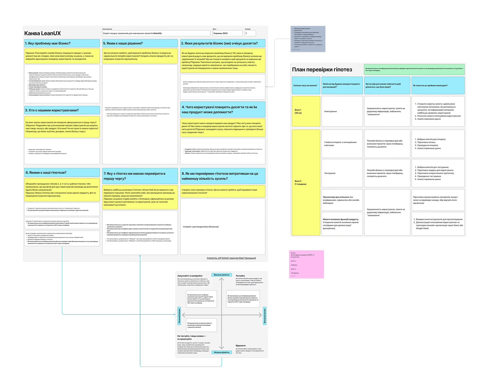
The Lean UX Canvas helped structure the initial assumptions. We then prioritized them by risk and value, selecting business willingness to trust student teams as the first hypothesis to test.
Proto-personas
Before the interviews, we built two generalized portraits based on the stakeholder briefing.
Proto-persona 1
👥
Victoria — curator/instructor
22–45 years old. Wants to find a real project for the students in her course. Values platform transparency and the quality of available projects. Fears that projects will be too complex or too simple, and that entrepreneurs won't be engaged enough.
Proto-persona 2
👥
Oleh — business representative
25–45 years old. CEO of a small startup. Wants to test risky ideas, but not with his own team's resources. Values saving resources and getting a fresh perspective. Fears incompetent contractors and wasted time.
For both personas we built a Value Proposition Canvas — to clearly see what value we offer and which pains we relieve.
Competitive analysis
We found no direct competitors in the Ukrainian market (except Junfolio, on which there was little open data). Indirect competitors — freelance platforms (Upwork, Freelancehunt), LinkedIn, local initiatives, bootcamps.
Our advantage: A structured course program with a curator, which lowers the risk for the business. This isn't a lone freelancer — it's a team with a mentor and deadlines.
Interview preparation
We built a Customer Journey Map of the current state — how businesses search for contractors to validate ideas today (without our platform). From the moment "I have an idea" to "I got the result."
This helped us frame the interview questions: we focused on the steps where we expected the most pain — search, selection, handing off the task, evaluating the result.
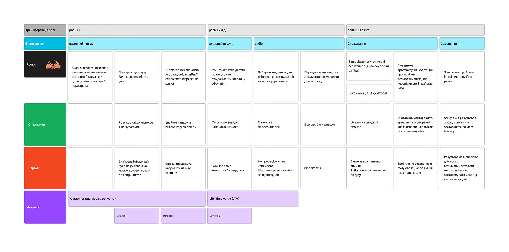
Before the interviews, we mapped our preliminary understanding of how businesses currently search for and work with contractors. This helped us identify the stages and assumptions that required validation.
Screening
Through an online survey we selected respondents with the right profile: business owners and managers who work with digital products and have experience validating business ideas. From 10 responses we selected 4 for in-depth interviews.
In-depth interviews
We ran four interviews, 30-45 minutes each.
Interview script
To avoid running everyone through the same template, we branched by the respondent's experience. The first couple of questions determined the branch:
- Had experience with IT courses → we ask about that specific collaboration
- Looked for contractors, but not courses → we ask about the contractor-selection process in general
- Validated business ideas on their own → we ask about their approach to validation
Before the work started
Text blhow they searched for a contractor, what criteria they chose by, how they handed off the taskock
During execution
How often they communicated, whether they had to adjust the task, how draining the interaction was
After receiving the result
Whether deadlines were met, whether expectations were met, whether they'd collaborate again
We built the guide around one principle: the respondent should recall real experience, not speculate about a hypothetical platform. So we almost never asked "would you use a service like this" — instead we asked them to describe how they had already solved this problem.
The script had three blocks that followed the chronology of a real collaboration:
03 — Insights
Businesses weren't just open to it — they were already doing it
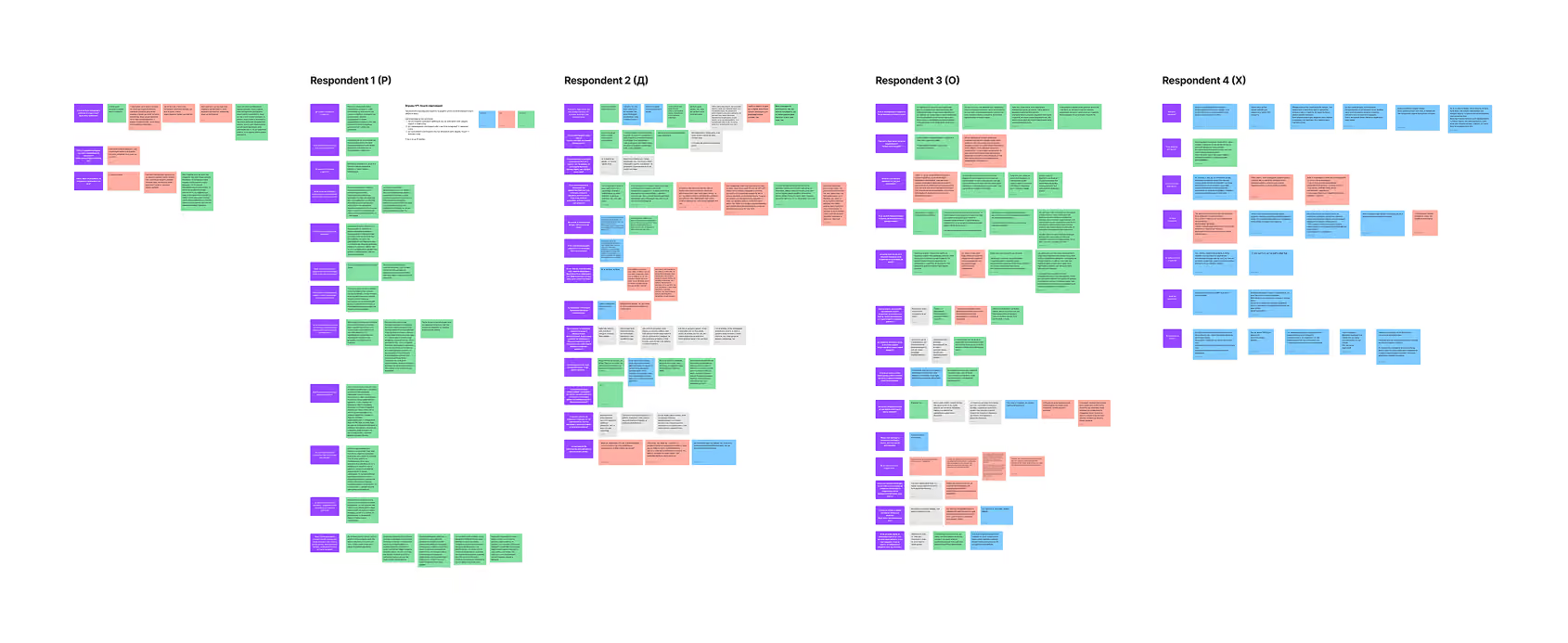
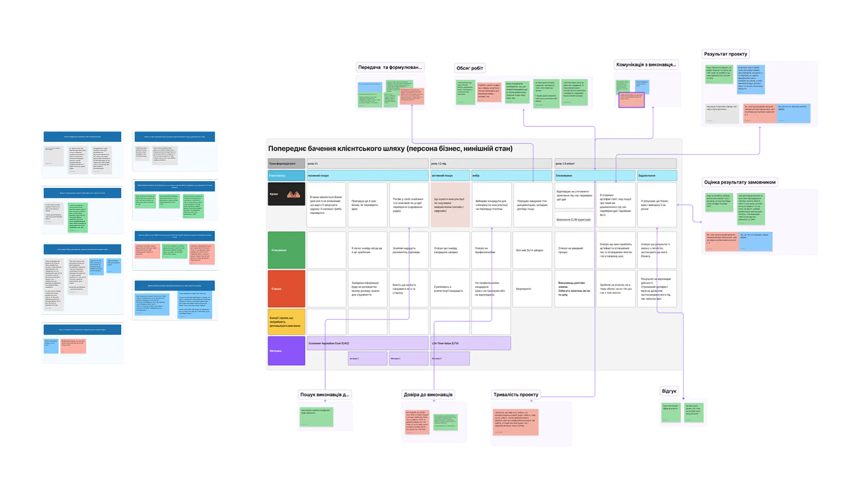
We first organized evidence from each interview, then grouped recurring patterns and mapped them onto the preliminary customer journey to identify where expectations, fears, and actual experience diverged.
The interviews gave us 13 confirmed statements about business behavior and a few surprises. Here are the key ones:
Confirmed:
- There is real interest among businesses in collaborating with students
- Businesses are willing to hand over fairly complex tasks
- Businesses don't expect a production-ready result — "more of a concept or a fresh perspective"
- Businesses are willing to pay for this kind of collaboration
- The instructor/curator's brand carries weight in the decision
- Businesses are willing to communicate often and adjust tasks along the way
Insight 1: students are a talent pipeline
All four respondents stressed that they view students as hiring candidates. It's not just "do it and forget it" — for businesses, it's a way to take a closer look at people.
Quote
"It's a great chance for students to prove themselves — not just to put something in a portfolio, but to already talk to a potential employer."
Insight 2: trust is built through people, not the platform
Quote
"If I didn't know these people personally, I probably wouldn't trust it — I don't know who they are, what this service is."
This meant: the landing page shouldn't just describe the service — it has to build trust through the curators' credentials, case studies, and transparency about the business model.
HMW workshop
After the interviews, we ran a workshop with the team and stakeholders. We used the "How Might We" exercise to turn insights into opportunities.
Six categories, with voting:
- Engage the business — how to make businesses aware of the opportunity and trust it
- Collaboration — how to organize a process that's transparent and effective
- Platform brand — how to build trust in an unknown service
- Course/instructor brand — how to communicate credentials and experience
- Course details — how to show competencies and task types
- Talent search — how to leverage the hiring potential
The vote set the focus of the design phase: engage the business and build trust.
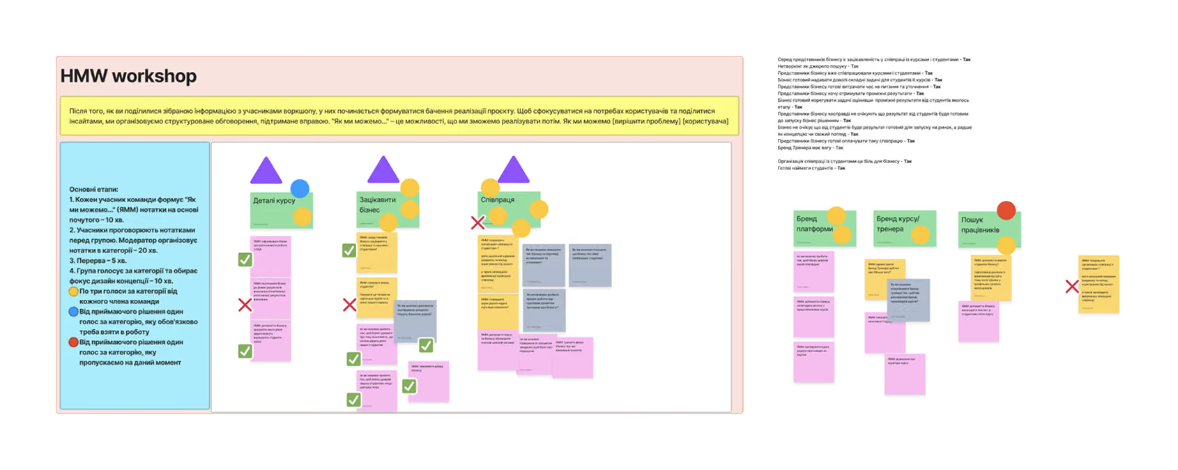
We translated the research findings into HMW opportunities and prioritized them with stakeholders, setting the design focus on business engagement and trust.
04 — Solution
The landing page had one job: build trust before the first click
Updated CJM
I didn't build the design system from scratch — I inherited it while the project was already in full swing. The system had been started before my involvement, with foundational components and tokens in place. My role was to evolve it: extending the atomic structure, adding new components for emerging needs, redesigning existing components to meet updated requirements, and ensuring it scaled across markets.
The key point: The most pain is at the "active search → selection" stage. This is where the business needs enough information to make a decision. That's exactly the stage our landing page had to address.
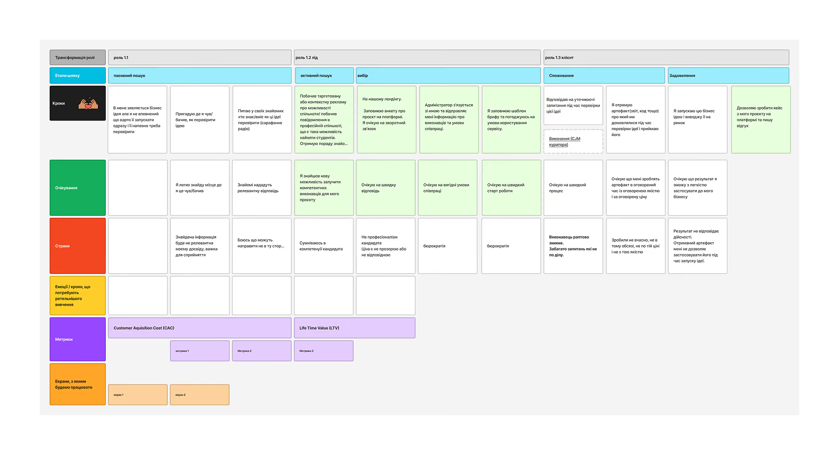
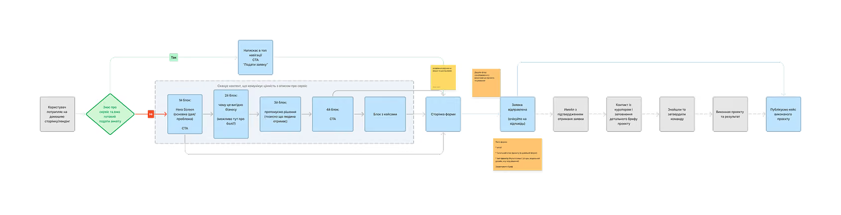
The updated journey showed where the platform could reduce uncertainty, while the user flow translated that opportunity into two paths: direct application for familiar visitors and trust-building exploration for first-time visitors.
User flow
We built the flow of the business persona's interaction with the landing page: from the first screen to submitting the form. Two paths: someone who already knows the service (straight to the form) and someone arriving for the first time (scans all the content).
Design evolution: from concept to final prototype
The prototype went through four iterations. Each one was a response to new data or feedback.
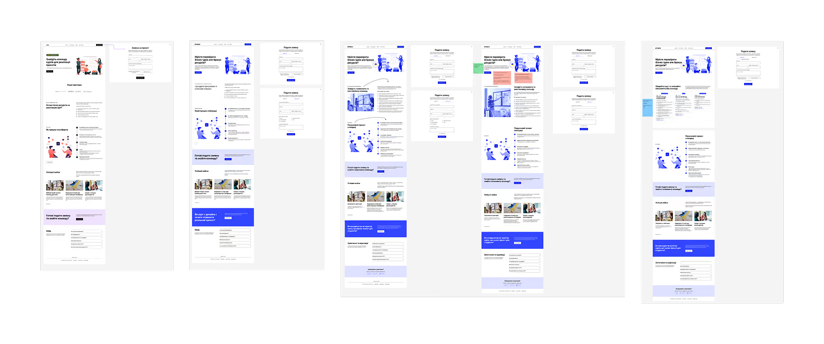
A basic landing page with a service description, the collaboration process, case studies, and a form. One general application form. Problem: too abstract — businesses can't see specific courses and competencies.
Added a "Why this matters to you" section listing what students can do. A CTA banner for courses. Two separate forms (business + course). Problem: the headlines don't resonate, no specifics about the teams.
Rewrote the headlines: "Find a talented and motivated team." Added partner logos. The step-by-step process expanded to 6 steps. Problem: still no course cards — businesses can't see who exactly they're hiring.
The key change: course cards appear, with descriptions of competencies, duration, instructor names, and price (the donation). Three courses: Product Design Fundamentals, Intro to UX Writing, Lean UX Canvas. This was a direct result of the insight that "businesses want to see specific competencies and the curators' credentials."
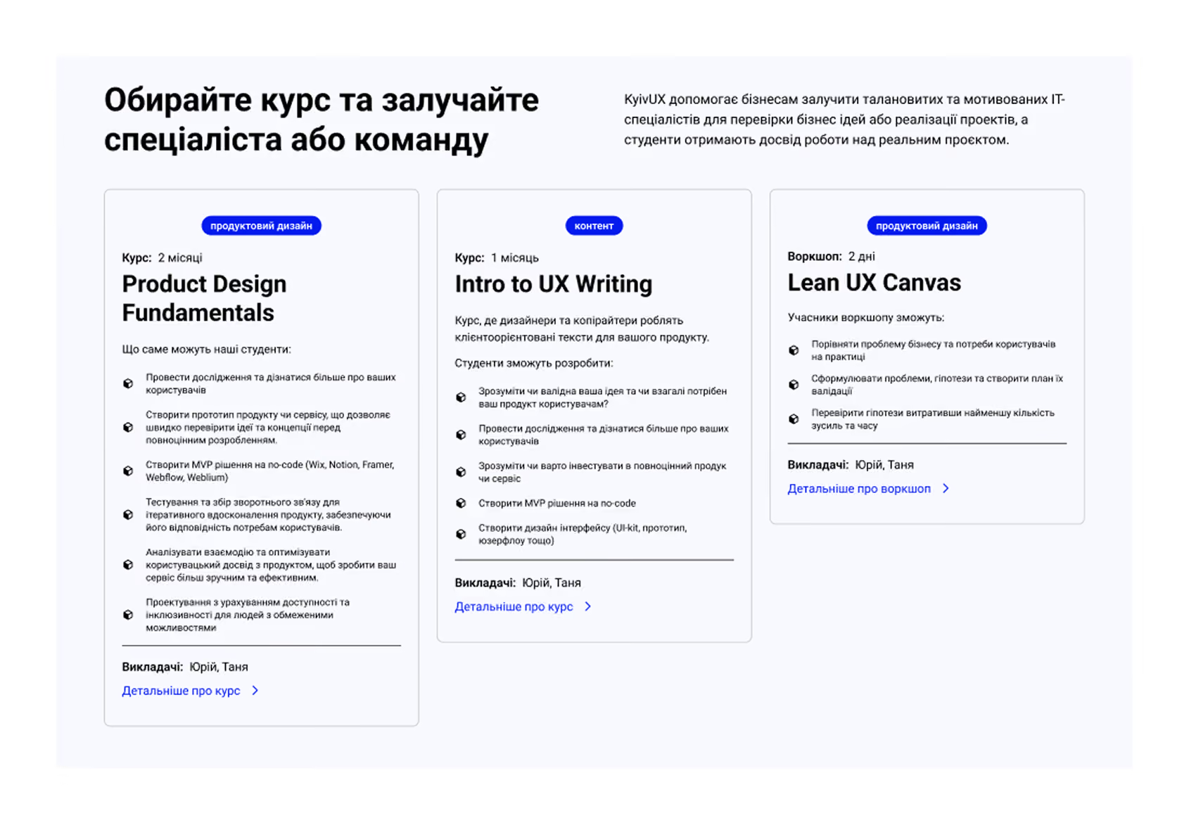
Concrete competencies, duration, and team context reduced uncertainty around what the business would receive.
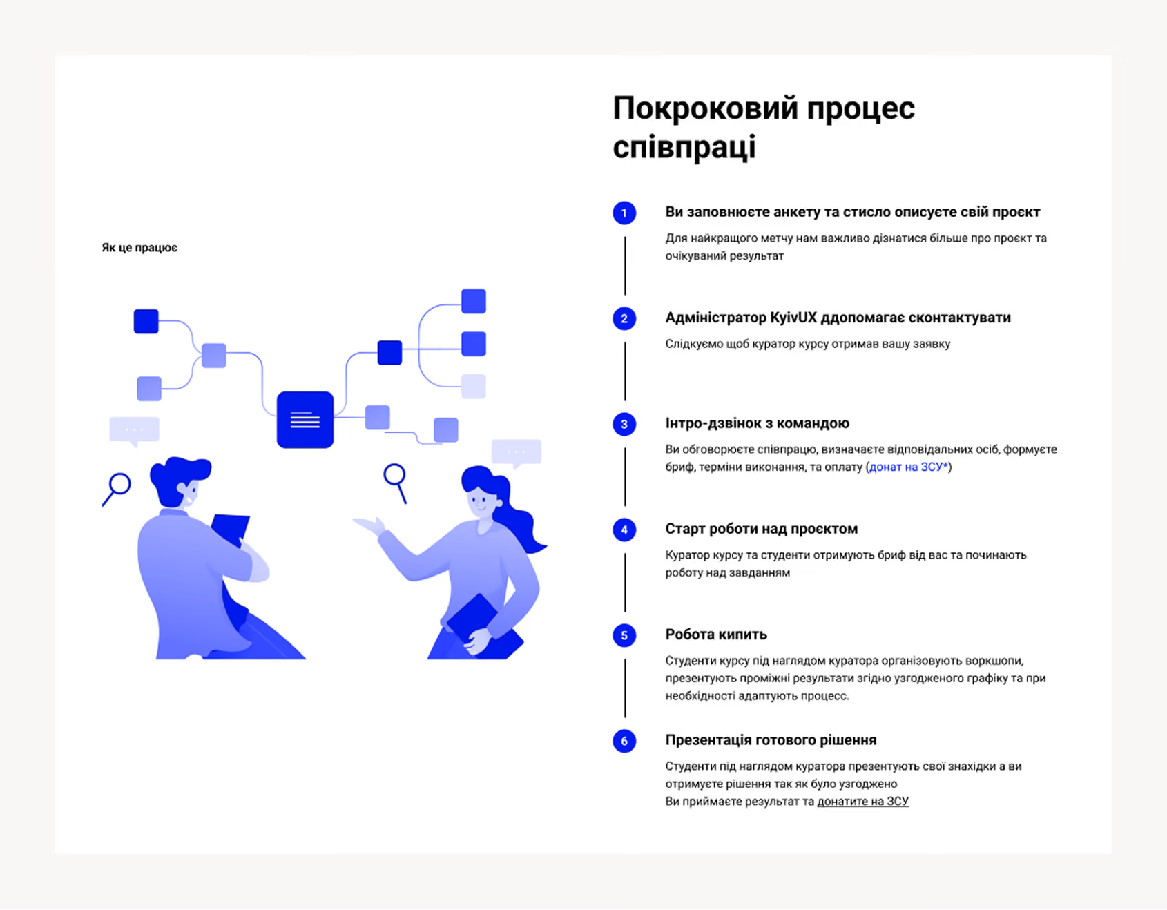
A clear six-step process made the collaboration model, responsibilities, and expected outcome more predictable.
Sections of the final landing page:
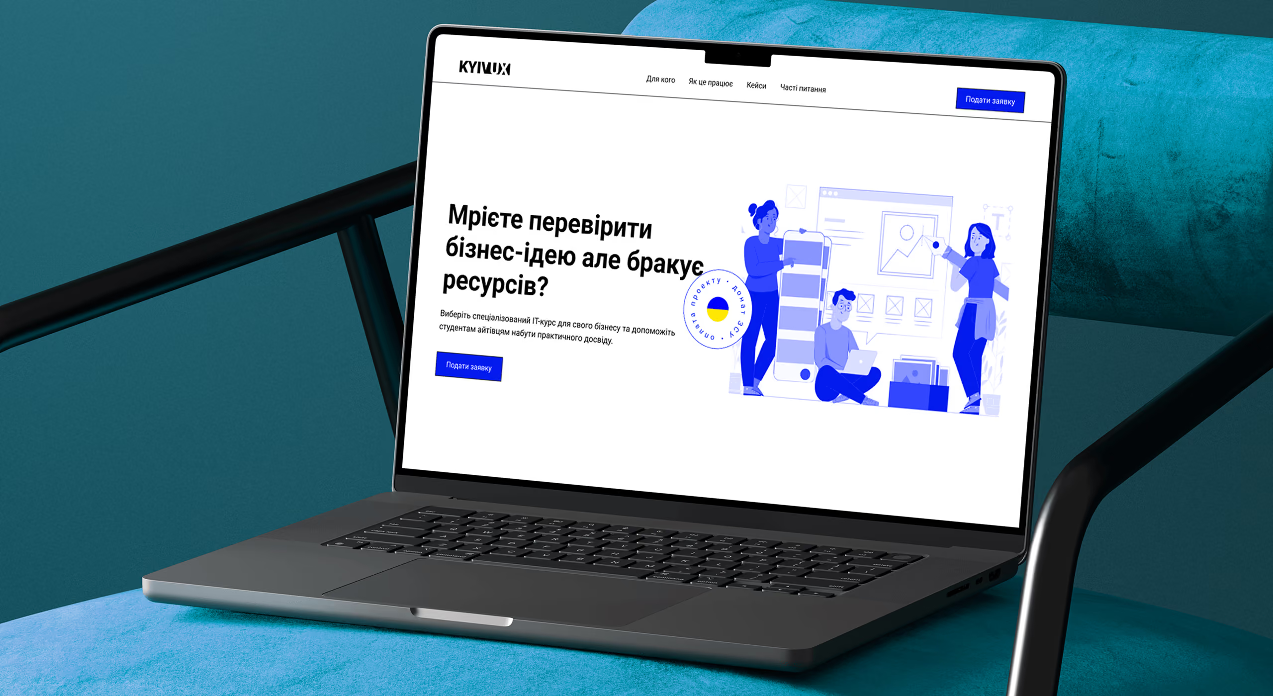
- Hero — "Dream of validating a business idea but lack resources?" + CTA
- Course cards — with competencies, duration, instructors, price
- Step-by-step process — 6 steps from application to result presentation
- CTA banner — "Ready to apply and find a talented team?"
- Success stories — real projects from Practical Product Design
- CTA for courses — "Are you an instructor or course curator?"
- FAQ — about project types, the brief, qualifications, the donation to the Armed Forces
- Application form — two tabs (business / course), minimal fields + brief upload
05 — Validation
Testing the prototype with four real businesses
Test design
Testing happened in two stages. First — an elevator pitch about the service and questions before showing the prototype (capturing the "mental model"). Then — interactive engagement with the prototype in Figma and questions afterward.
The respondent's task: "Imagine you want to order a project. Pick a course, find the price and duration, and submit an application."
Four metrics on a 5-point scale:
- Completeness of information for decision-making
- Ease of use
- Level of trust
- Usefulness of the information
Results
| Metric | Before prototype | After prototype | Difference |
| Information completeness | 3.0 | 4.0 | +1.0 |
| Trust | 3.0 | 4.0 | +1.0 |
| Information usefulness | 3.0 | 4.0 | +1.0 |
| Ease of use | 4.5 | 4.0 | −0.5 |
Average scores on a 5-point scale across four moderated sessions. The results show a qualitative direction rather than statistical significance.
The service idea resonated, but the offer was not clear enough
All four respondents saw value in the service, and two already had real projects they would consider outsourcing through it.
Critical usability issue
Testing revealed one critical issue: the course cards made the platform look like a place to buy a course rather than hire a student team.
Quote — Respondent 2
"The main thing that threw me off was the course block. It feels like you're buying a course, but I don't want a course — I want a team."
Demand signal
All four respondents saw value in the service, and two already had real projects they would consider outsourcing through it.
Quote — Respondent 4
"I'd gladly use it, because there are projects I could outsource this way."
The concept itself was relevant, but the value proposition needed to state much more clearly that businesses were hiring a project team formed around a course, not purchasing the course itself.
The testing gave us a clear direction for the next iteration: retain the trust-building content, simplify the framing, and make the hiring model explicit from the first screen.
06 — Recommendations
What to fix before launch
Based on the testing, we put together prioritized recommendations for the stakeholder.
Critical — the landing page doesn't work without these
- State clearly "you are hiring a team" — to remove the confusion with buying a course. In large type, in the heading of the course section.
- Show detailed course information right on the site — respondents expected a modal or a dedicated page, not an external link.
- Add the instructors'/curators' credentials — degrees, experience, seniority. This directly affects the decision.
High — will significantly improve conversion
- Explain: project duration ≈ course duration — add a line like "During the course, students will work on your project.
- More courses to choose from — three is too few, especially for large IT companies. Add a "Help me choose a course" button for those who didn't find a fit.
- A brands section — logos of companies you've already worked with.
- Explain the donation business model — where the donation goes, reports, why it isn't a commercial model.
Nice-to-have
- A downloadable brief template inside the application form.
- A more compact form — the "Apply" button should fit within one viewport.
- The ability to apply even without choosing a specific course.
Impact
The research gave the stakeholder a clear answer to the main question: businesses are ready to work with student teams — provided the service removes the trust barrier through transparency, case studies, and visible curator credentials. The recommendations became the basis for the service's further development.
4
in-depth interviews with business representatives (IT + real sector)
1
HMW workshop with the team and stakeholders
4
prototypeiterations
4
moderated usabilitysessions
13
validated statements about business behavior
2 of 4
respondents ready to usethe service right away
07 — Reflection
Trust is built through people, not interfaces
Narrowing the focus was the right call
Better to research one segment deeply than two shallowly. If we'd spread ourselves across students and business at once, none of the conclusions would have had enough depth.
4 interviews were enough for qualitative insights, but not for statistics
By the fourth interview, the key themes were already repeating, which gave us confidence in the direction. But for reliable conclusions about conversion it wasn't enough — the next step would be an A/B test on a real landing page with a larger sample.
Trust is built through people, not interfaces
The project's strongest insight: businesses trust not the platform but specific people — the curator, their reputation, the case studies. Design should reinforce that, not replace it.
The student segment remained unexplored
That's a separate opportunity for the next iteration — to understand what curators and students need from their side.