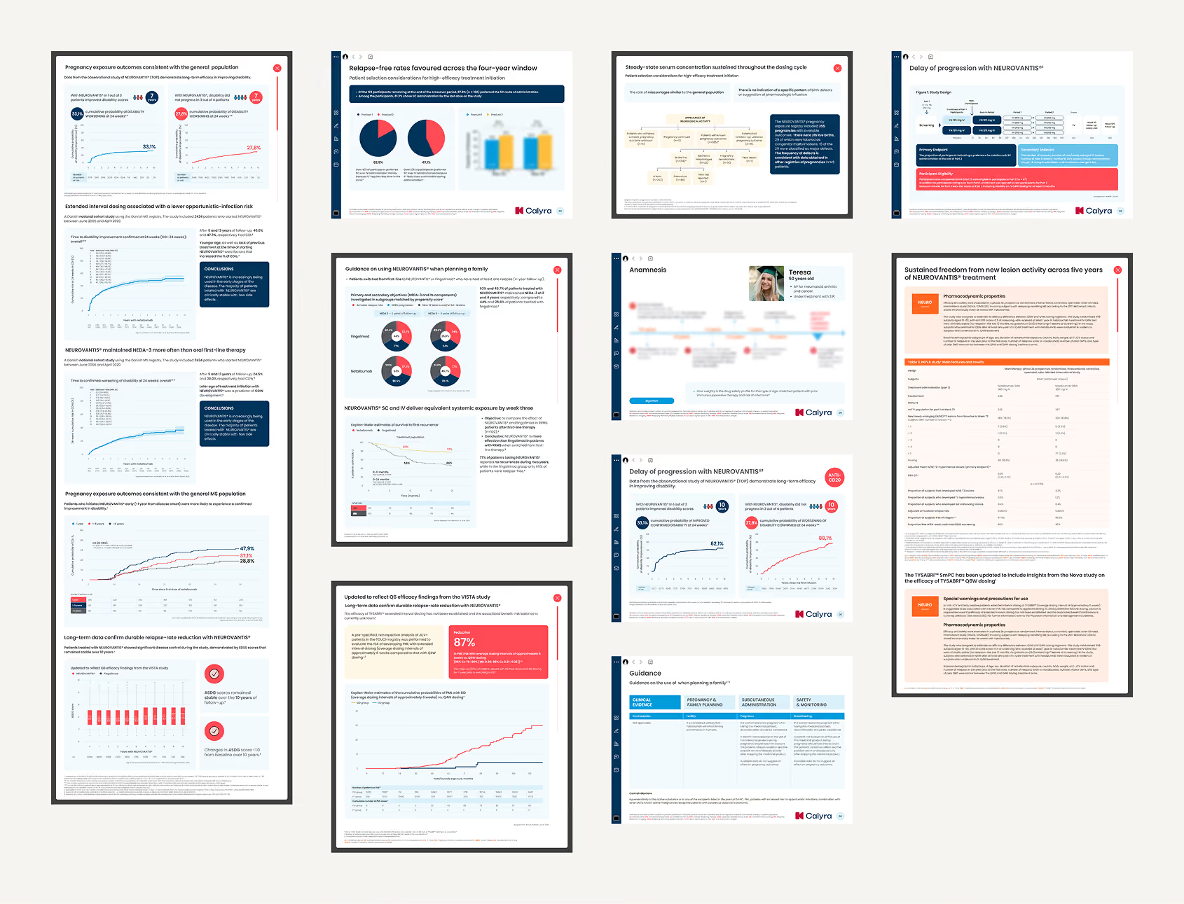
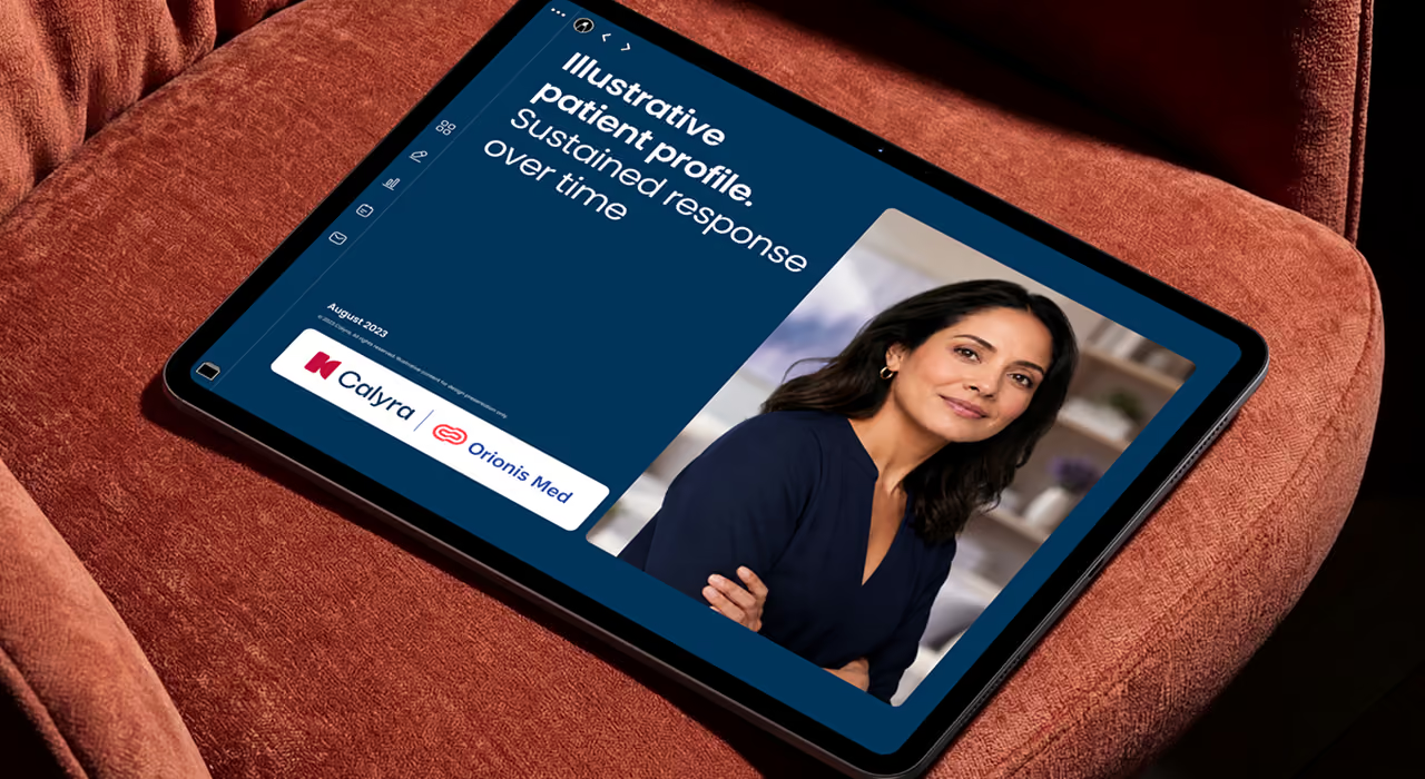
Redesigning a modular pharma sales tool for global and local teams
A design system redesign for Interactive Visual Aid — directional user research, UI updates, and component library work under strict medical-legal constraints.
Sector
Pharma · B2B · Sales enablement
Year
2023
Timing
3 months
Role
Senior Product Designer (outstaffed)
Type
Research · UI · Design System
3
researched markets
(UK, CA, AU)
(UK, CA, AU)
300
+
screens delivered
01 — Context
A pharma sales tool that hadn't been redesigned in over seven years
The problem
In that time new product variants launched, new markets were added, new data accumulated, and user needs evolved. The system couldn't keep up:
- Components were outdated and inconsistent across markets
- New requirements couldn't be met with existing patterns
- There was no systematic approach to scaling across regions and languages
- The visual language looked dated compared to modern pharma tools
Before
After
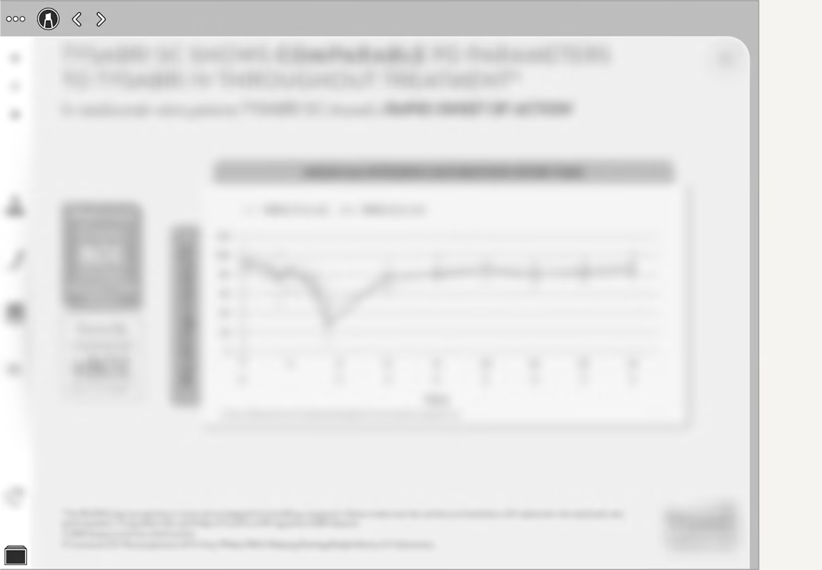
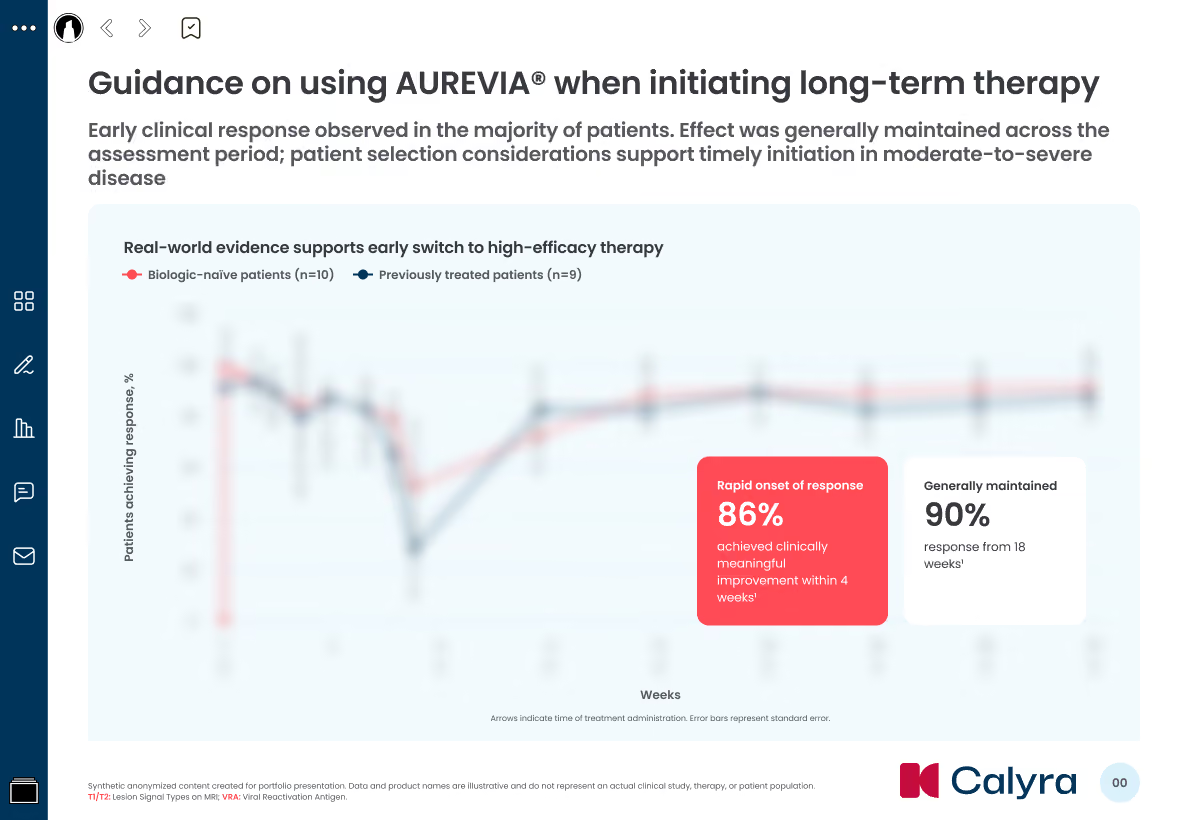
Design debt was visible across core slide patterns. Anonymized legacy screens showed inconsistent component treatment, limited hierarchy, and layout patterns that were difficult to scale across markets.
The triple constraint
What made this project uniquely difficult wasn't the design itself — it was the intersection of three constraint layers that shaped every decision:
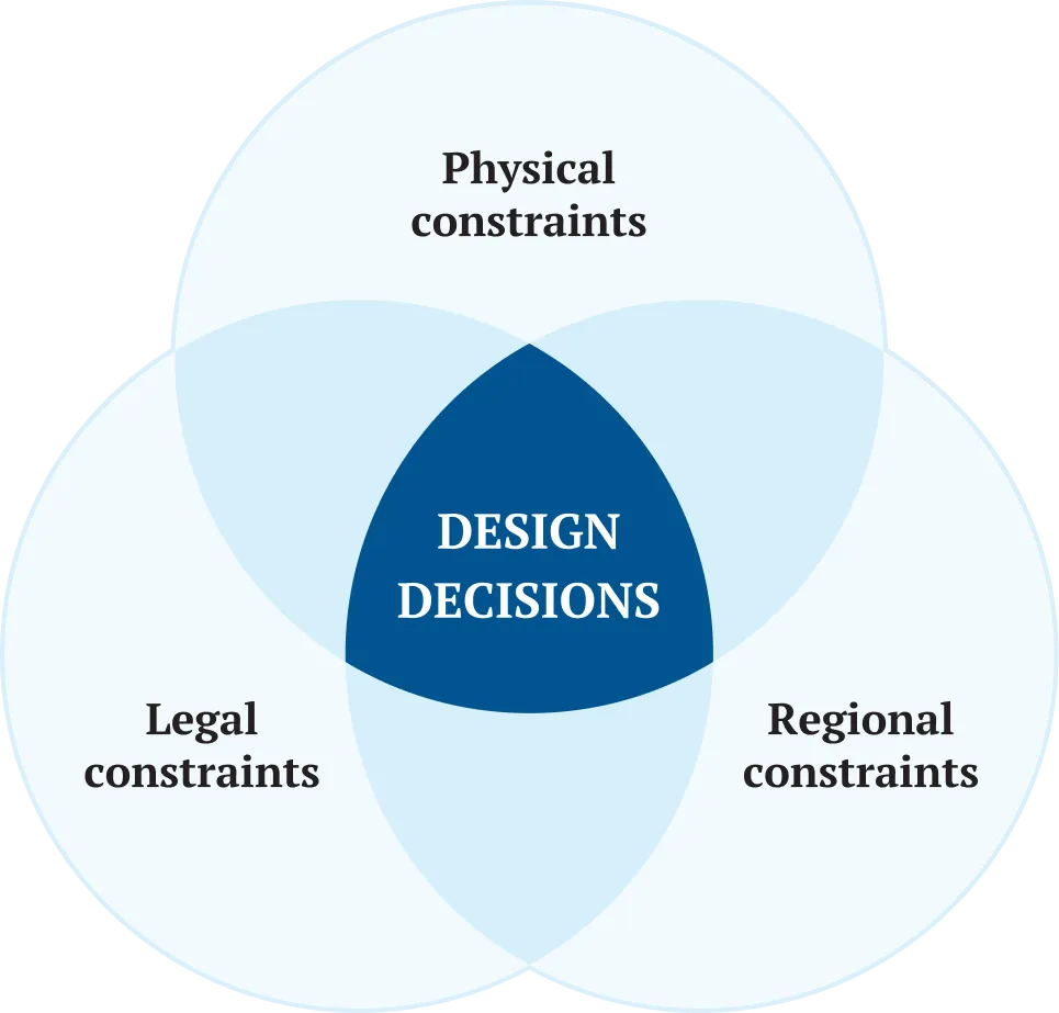
The design challenge was not creating a cleaner UI. It was building a system that could stay usable, compliant, and localizable at the same time.
My role
I joined as an outstaffed senior product designer. The client needed to strengthen their internal team, so they contracted a senior-level resource through my agency. I went through the interview, completed onboarding, and started delivering early — despite the complexity of the pharma domain.
My responsibilities included:
- Co-running user research with sales representatives across three markets
- Synthesizing interview findings into themes, insights, and design implications
- Designing and refining IVA screens within medical-legal and platform constraints
- Updating existing components and extending the design system for new slide patterns
- Supporting multi-market localization through reusable layouts and scalable templates
- Presenting design decisions and rationale to the design lead and stakeholders
Ramping up on a complex pharma design system mid-project was part of the challenge. I had to understand the existing component logic, regulatory constraints, medical terminology, and multi-market workflows while continuing to deliver production-ready design work.
02 — Research
The direction was working, but reps wanted less text and faster ways in
Research ran in parallel with design. Instead of treating the sessions as a task backlog, we used them as a directional check on screens that were already being produced.
We conducted 6 in-depth interviews with sales representatives across 3 markets: the UK, Canada, and Australia. Each session combined workflow exploration with a screen-by-screen concept walkthrough.
The strongest signals were clear: reps preferred data and graphs over text, needed faster ways to navigate to relevant content, and consistently struggled with readability on dense slides.
Research setup
Four usage scenarios
One of the first insights was that there isn't one way to use an IVA. Respondents described four distinct scenarios, each with its own requirements:
Scenario 1
🤝
1:1 face-to-face
Flexible navigation during physician conversations, with the iPad shared between rep and HCP.
Scenario 2
🖥️
Virtual meeting
Screen sharing over Teams or Zoom, often with the iPad used as a second device.
Scenario 3
👥
Group presentation
Larger-room settings where readability from distance mattered more than touch interaction.
Scenario 4
⚡
Exhibition stand
Quick 30-second interactions where reps needed immediate access to specific data points.
This mapping became the foundation for design decisions — every change had to work across all four scenarios, not just the most common one.
Key expectations across scenarios
Across these scenarios, three expectations became clear: reps needed credible data to show physicians, faster access to relevant content, and more flexibility to tailor the story for each meeting.
Show credible data
Reps needed content and data they could confidently use with physicians.
Navigate quickly
The IVA had to support fast jumps to relevant sections during live conversations.
Tailor the story
Reps wanted better ways to prepare or select slides for a specific meeting.
Key findings
Concept testing was structured around 6 themes — Usability, Navigability, Readability, Content, Embed features, Layouts — and produced ~19 synthesized insights.
The findings that most shaped the design direction:
Data over text
Reps needed content and data they could confidently use with physicians.
Slide picker as the main way in
Most reps relied on the all-slides view to jump directly to relevant content during meetings.
Design direction validated
The refreshed visual identity, color direction, and layout approach were received positively.
Content mismatches surfaced
Some slide titles did not fully match the data shown, creating a recommendation for a future content audit.
Readability under compliance pressure
All participants flagged small text on graphs, footnotes, and dense slides, but content could not simply be removed.
Feedback into design priorities
The research didn’t produce a simple backlog of fixes. It clarified where the redesign had to focus: making approved content easier to scan, helping reps reach the right slide faster, and supporting different meeting contexts without breaking compliance constraints. This gave the team a clearer basis for design decisions — what to improve immediately, what to document as a recommendation.
03 — Design decisions
We changed what compliance allowed, and documented the rest
This was directional research, so not every finding turned into an implemented change. Some decisions we delivered within the constraints; others we documented as recommendations for future iterations. The status of each is marked explicitly below.
Decision 1: Icon affordance
Finding: Some users perceived decorative icons as interactive elements. On slides like "Building on more than 15 years of experience," the efficacy and safety icons looked clickable. Respondent 2 (UK): "I have the feeling that I would click on it." Respondent 3 (Canada): "It looks like there is something behind." Respondent 5 (Canada): "I thought it was a button that... would go to the study. But that's not the case."
Constraint: The icons served an important visual function — they helped organize information and created visual anchors on data-heavy slides. Removing them entirely would make slides harder to scan.
Solution (multi-layered):
- Removed button-like containers and visual treatments (borders, shadows, raised appearance) so icons read as illustrations, not interactive elements
- Added descriptive labels and captions to clarify the meaning of each icon
- Adjusted sizing and positioning so icons integrate into the layout as supporting elements rather than standalone targets
(We deliberately did NOT make the icons clickable — that would have expanded scope and required new drill-down content, beyond this iteration.)
Principle: Match perceived affordance to actual functionality. If it looks clickable, it should be clickable; if it's informational, it should look informational.
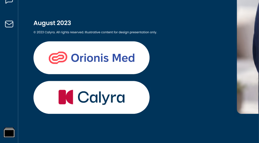
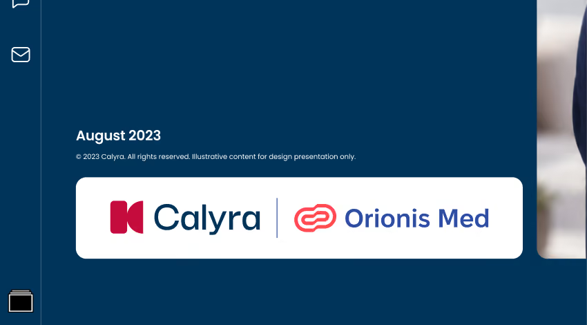
Before
After
The early version made the logos feel like separate clickable buttons. The final version combines them into one informational block, reducing false affordance and making the layout easier to scan.
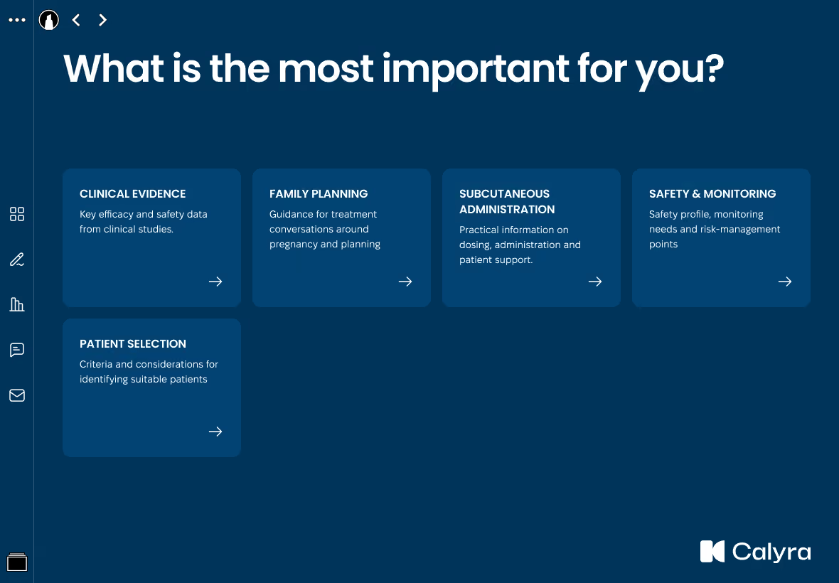
Decision 2: Turning a plain chapter grid into a guided navigation hub
Finding: Several users found the chapters page "too plain" — a thumbnail grid with no context for navigation decisions. Respondent 6 (UK): "It's okay, it's fine, it's a little bit plain." Respondent 4 (Australia): "I would definitely add some visuals to each tag. Or maybe even a brief summary of what's the content of each chapter."
Constraint: The chapters page was a critical navigation hub — the second most-used navigation path after the slide picker. Any change had to improve clarity without slowing down users who already knew where they were going.
Solution:
- Added short descriptions to chapter blocks, giving reps context for navigation decisions
- Improved visual separation between blocks — moving from a flat thumbnail grid to clearly delineated sections with better hierarchy
- Updated typography, colors, and spacing in line with the refreshed design system
Impact: The chapters page evolved from a simple thumbnail grid into a structured navigation hub that matches how sales reps pre-plan their meetings — scanning for the right section before diving in.
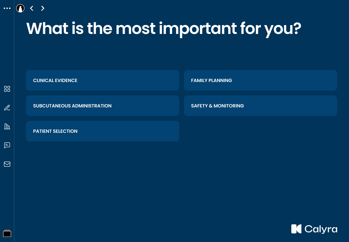
Before
After
The early layout worked as a simple list of chapter buttons: fast to scan, but lacking context for choosing the right section. Research feedback showed that reps wanted more guidance before opening a chapter.
Decision 3: Content hierarchy under compliance — Partially implemented
Finding: The strongest and most unanimous signal — less text, more data visualization. Respondent 1 (UK): "we need to pull out the key figures in there." Respondent 3 (Canada): "I'd rather show them data."
Constraint: This is where pharma design gets genuinely hard, and it's the intersection of three constraints at once:
- Platform — the physical iPad screen size limits how much you can show legibly
- Legal — medical-legal compliance requires a specific set of data, footnotes, and disclaimers on a slide; content can't be split across slides without re-approval (legal + medical affairs + regulatory), which adds weeks
- Nature of the research — this was directional feedback, not a mandate to rework every slide
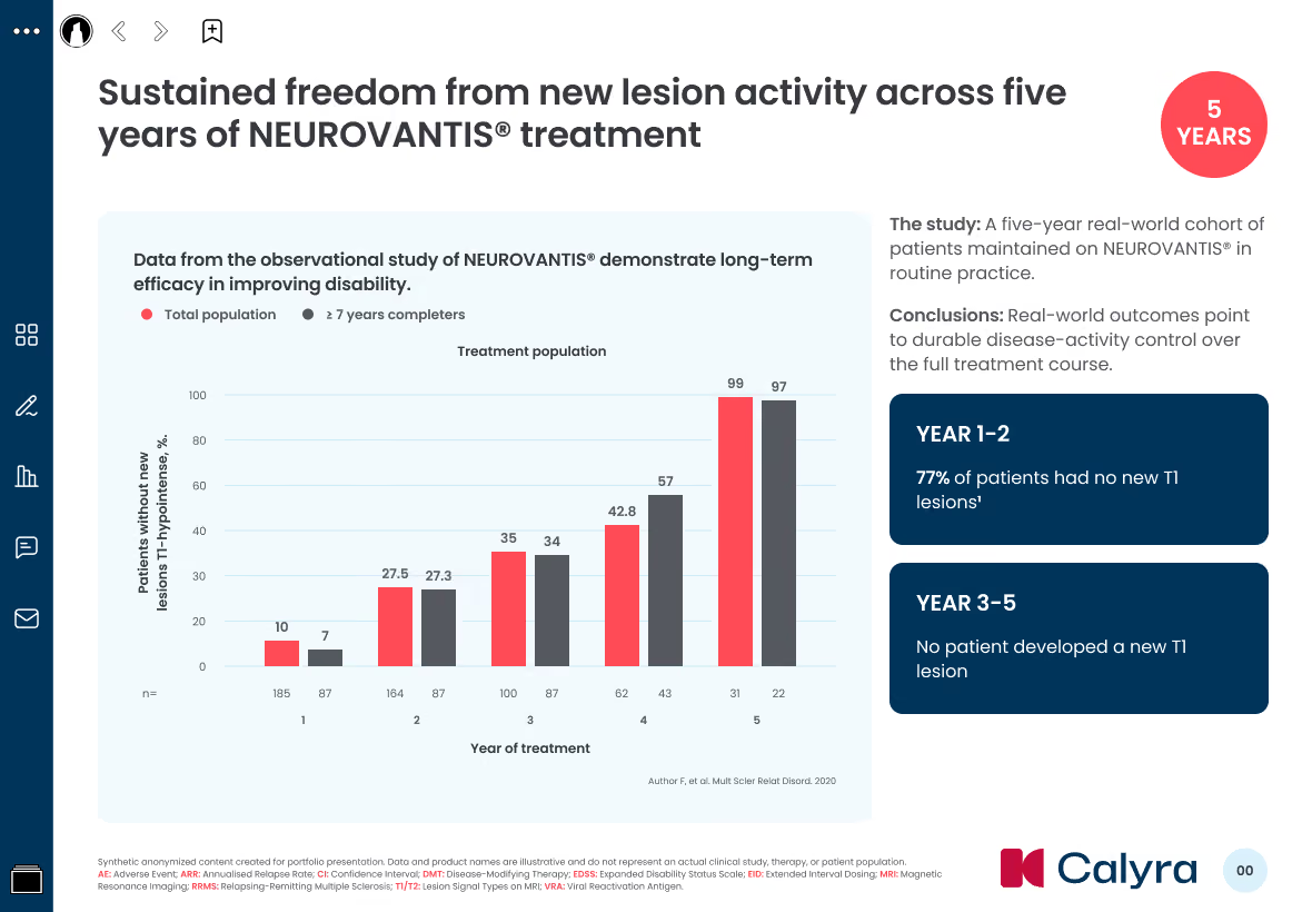
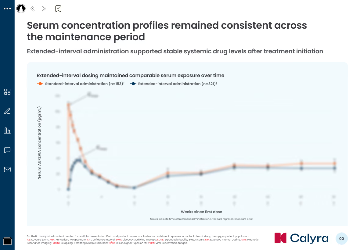
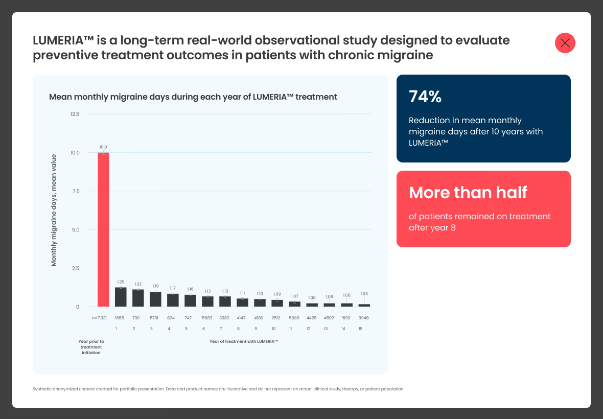
Solution (within what was possible): We didn't rewrite the content — most of the copy was produced by other departments within compliance. Instead we worked with styling: we bumped up the size of key figures, improved contrast and visual hierarchy wherever it didn't break requirements, and used research feedback as an argument in cross-functional discussions. There was no universal recipe — solutions were chosen situationally, slide by slide. Honestly: we did what we could within the constraints — not every slide was transformed, and some limits were genuinely immovable.
Outcome: A better balance between compliance and readability without violating regulatory requirements. The research gave us a framework for prioritization — where changes would have the most impact — and evidence that resonated with non-design stakeholders.
Decision 4: Fragment sharing discoverability — Recommendation
Decision 5: Sentiment analysis — Marked to be dropped
Decision 6: IVA pre-selection for a specific meeting — Recommendation
04 — Design system
I inherited the system mid-project and extended it to scale across markets
Inheriting the system mid-flight
I didn't build the design system from scratch — I inherited it while the project was already in full swing. The system had been started before my involvement, with foundational components and tokens in place. My role was to evolve it: extending the atomic structure, adding new components for emerging needs, redesigning existing components to meet updated requirements, and ensuring it scaled across markets.
Atomic design in practice
The system followed atomic design methodology — atoms (tokens, base styles), molecules (simple components), organisms (complex patterns), templates (slide layouts). This wasn't theoretical, it was practical. When a new slide type was needed, we composed it from existing molecules rather than designing from scratch. When a component needed updating, the change propagated through the system.
Designing for multi-market deployment
One of the most important architectural decisions was building for localization from the start. The design system and slide templates were engineered for multi-regional deployment in different languages, without the need for an in-app language switcher. Each market gets a localized version built on the same component library and design tokens.
This means:
- Layout patterns accommodate different content density and text length across localizations
- Regional variants are systematic, not one-off exceptions — for example, Canada without lifestyle imagery, markets without the newer drug formulation
- Design tokens ensure visual consistency across all localizations
- Brazil was planned as a separate deployment market on the same system
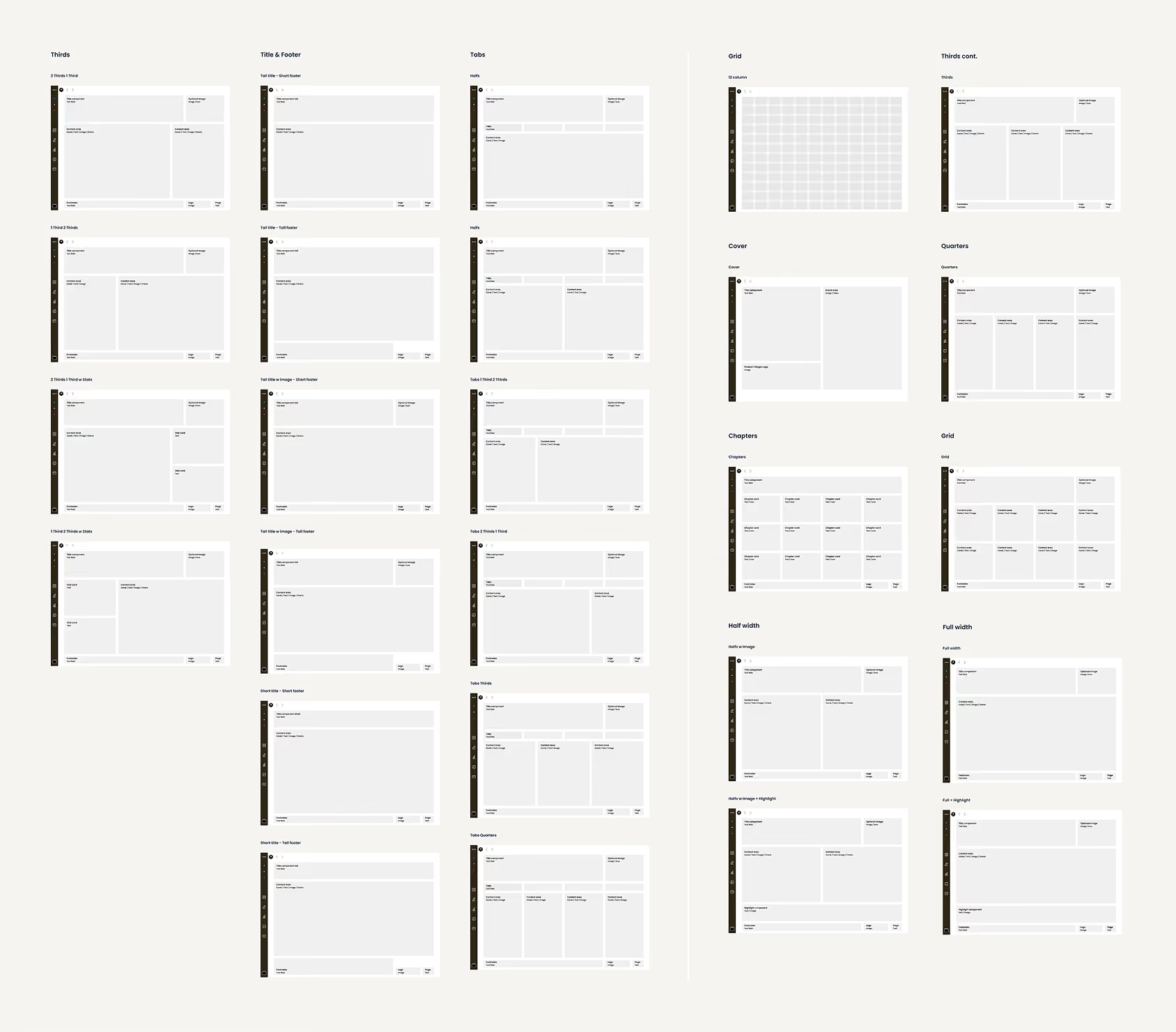
Example of grid and layout which we created and used during work
05 — Impact
The clearest sign it worked was the client extending the contract
Research impact
- Conducted 6 in-depth user interviews across 3 markets: UK, Canada, and Australia
- Synthesized around 19 insights into 6 themes: usability, navigation, readability, content, embedded features, and layouts
- Documented 4 key usage scenarios for how medical representatives use the IVA in real sales conversations
- Identified 1 feature to drop, helping reduce scope based on actual user needs
- Captured a new product opportunity: pre-selecting slides for a specific meeting
- Created research artifacts that can be reused for future IVA products and market rollouts
- Gathered positive field feedback after the updated IVA was used in real sales contexts
Design impact
- Delivered a final slide library of 300+ screens
- Systematically addressed 7+ years of design debt across structure, visuals, navigation, and layout patterns
- Updated existing components and created new reusable patterns within a large-scale design system
- Validated the new design direction through research with real users
- Supported growth caused by new market localizations and the launch of a new drug formulation
- Created a multi-market architecture that allowed regional deployment without rebuilding the system from scratch
Business impact
- Contract extended by 40% — the client added one more month to support increased scope and chose to keep a senior outstaffed designer on the project
- Research became an evidence base for medical, legal, marketing, and regional stakeholders
- The modular design system created a reusable foundation for future IVA rollouts, reducing the need to start each market adaptation from scratch